

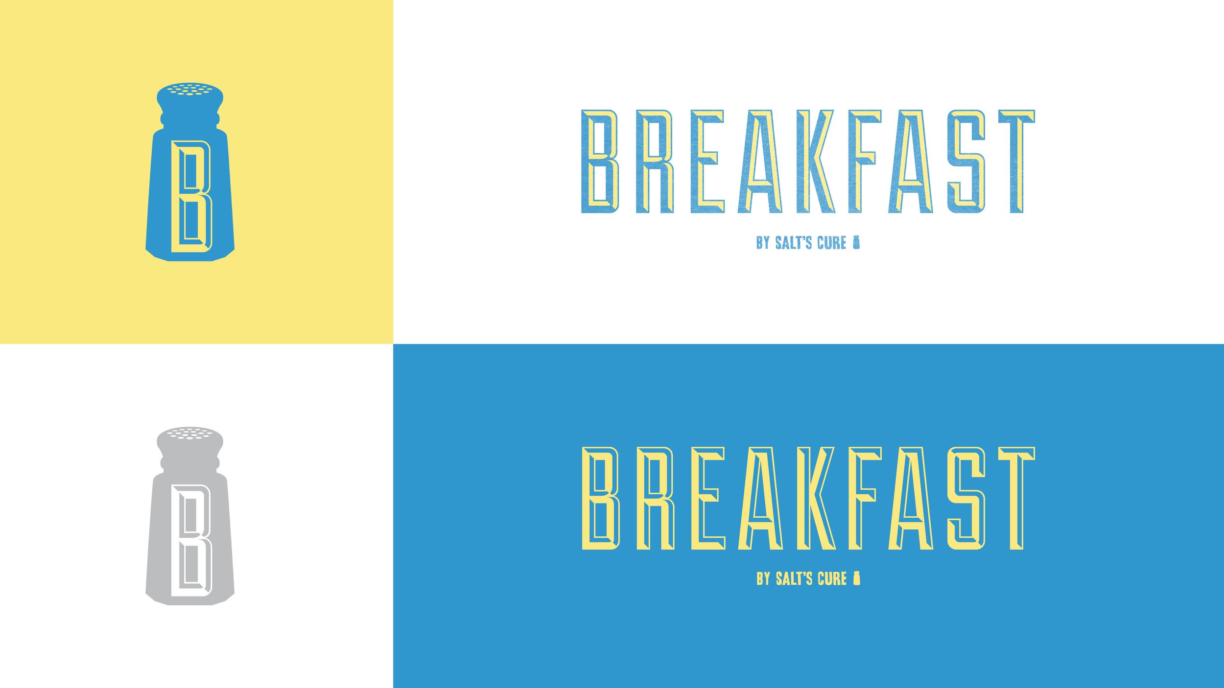


BREAKFAST by salt’s cure
The sister restaurant to Hollywood’s, Salt’s Cure, was in need of a logo that communicated it’s elevated, yet unpretentious approach to classic breakfast food. A logo, business cards, t-shirts for staff, packaging for griddle cake mix and recipe cards were created to put Breakfast By Salt’s Cure on the map.


Goodman solutions
Formerly, Goodman Networks, the company created and maintained wireless networks across the United States. In early 2020 the company decided to pivot and become Goodman Solutions, a premium installation company serving technology brands.
The ‘G’ icon, derived from the shape of hexagonal nut as a nod to Goodman Solutions’ work in installation was developed, along with business cards, uniforms and a full brand guidelines book.


Lincoln Beer co.
A craft Brewery in Burbank, CA was in need of packaging design for a few of their most popular beers. Leaning on the simplicity and minimalism their brand embodies, 12 and 16 oz editions of cans were produced.


Duff pop-up event for Lincoln beer co.
Lincoln Beer Co. partnered with The Simpsons and Twentieth Centruy Fox to create a Duff Crafted Lager for a one day pop-up event taking place at their brewery. The logo created for the tap handles, 12 oz collectible glasses and coasters had to bear enough resemblance to the cartoon Duff logo, while also making it believable as a modern beer brand.
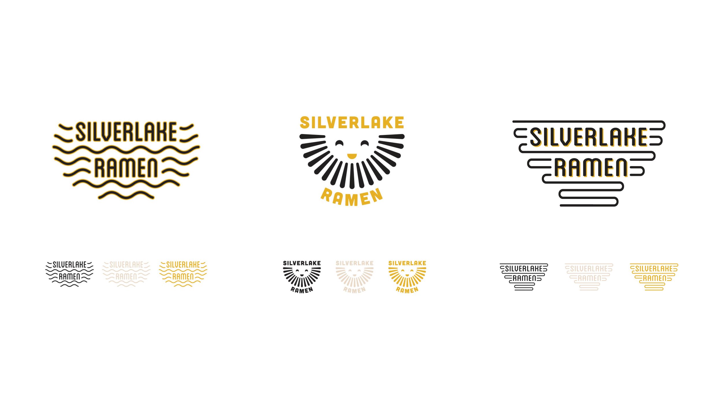
Silverlake ramen
A brand refresh exploration for the L.A. staple, Silverlake Ramen. As the brand began to open several new locations, they were in need of a more memorable and modern logo.

Chubby’s dip
A brand exploration for restaurant, Chubby’s Dip. Chubby’s Dip is a fast-casual restaurant specializing in a French dip sandwich made unique by it’s Yorkshire pudding bread.